top of page
Rosekandy is one of the leading tea retailers, specially in Tier II cities in India. The term "Rosekandy" itself is synonymous to tea for its customers.
The research for this project revealed that consumption of quality products has been growing exponentially, specially in the food and beverage industry.
We wanted to make sure that the packaging highlights the nutritional aspect of Rosekandy's tea - rich in antioxidants.

COMPETITORS' PACKAGING AS DEPICTED ON COLOUR WHEEL
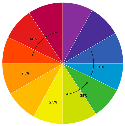
On analysis of its competitors, interesting data points were revealed in terms of color usage, type setting - more or less most of the teas had the same appeal, in terms of layout, color palette.

PREVIOUS PACKAGING OF ROSEKANDY
Research showed that consumers have become more conscious and have move towards packet tea consumption rather than purchasing loose leaves in the Tier II and Tier III cities in India, due to its perceived quality and better storage options.


NEW PACKAGING DEVELOPED
An export friendly packaging that gives a premium look & feel - keeping in mind that households associate dark color with superior quality.

250 GMS PACKAGING
The illustrations for this weight were carefully thought out. This approach was taken as it had been less explored and to make the product stand out on the shelf.
The bottom left represents the Rosekandy Tea Estate in Assam that has a huge pond in it. Elements of Kulhad - a cup made out of clay famous in India for drinking tea in, tea leaves and tea plucker were introduced.


Rosekandy decided to go ahead with two different package designs - keeping in mind that each design should appeal to the mass.
Ideally one would alter between colors for the same design but with the key problem at hand - repeated copying throughout the years, it was decided to have two seemingly different designs for their different weight offerings.
100 GMS PACKAGING
The Camellia Sinesis plant set across a dark backdrop - to seamlessly communicate the premium quality of Rosekandy Chai.
A clean look with a different type-setting that has been rarely explored before in this industry.


bottom of page